I have seen the bait and thought better of my time than to jump into this debate, but hell, it’s Saturday morning, and I have nothing better to do than to jump into a brewing debate that ultimately doesn’t matter to me. Why not?
Since the watchdog outed the $46,000 logo design of the state of TN, Facebook has been a tizzy. Every part-time designer on The Facebook has shared their opinion. Ugh.
Contrary to the widely held belief that marketing professionals evenly divide their days surfing Facebook, Twitter, coloring with crayons, having craft time, and kicking out shitty logos from time to time, there is some art, some science, and some psychology that goes into the work–especially the crayon drawings on the big paper with the really big crayons. If you’re in the marketing profession you know, that your primary job is to sit back and wait for the real professionals to tell you how to do your job.
The Oatmeal does a fantastic job of describing the creative process.


You’ve heard the old adage, “A camel is a horse designed by a committee.” Well… designers of the world unite.
The clever criticism here is that the “icon ‘I could’ve made on MS Paint by accident'” is associated with $46,000. This presumes that the designer charged $46,000, which is not the case. Just reviewing the dozens of disconnected logos took hundreds of hours. You could have hired day laborers at $10 an hour and still not accomplished that feat for less.
![]()
It’s a branding nightmare. The total state budget is $32.6 B, so this rebranding effort was less than 1/100 of 1%. That’s worthy of outrage?
So what if you can create a logo in MS Paint?
Could the same be said of the current version of these logos?
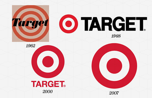
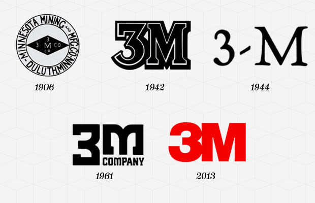
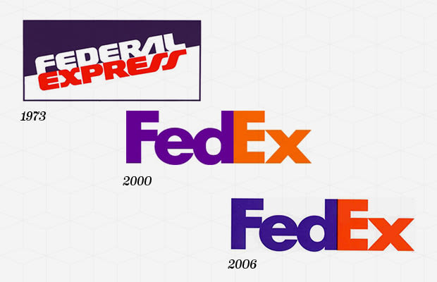
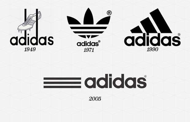
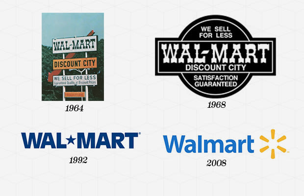
All of these fonts trend towards simplicity and typographical treatment instead of strong graphical treatment. They are clean, and they work.
The Gap
In 2010, The Gap introduced a new logo that was part of a $200 MM+ rebranding campaign. TWO HUNDRED MILLION, PEOPLE. The social designers of the world went crazy, and The Gap pulled it. The funny part of this story is that people said the very same thing of the Gap logo-“I could create this logo in MS Paint.” While the precise design fee The Gap paid is undisclosed, I’m sure it is more than $46,000.
![]()
The Gap caved. Shame on the CMO for not having the courage to stand up and publicize the logo. When compared to the original Gap logo, it actually showed a maturity with the “grown up” sans serif word mark while still paying homage to the 1990-2010 logo with the blue square. Also, the 2010 logo actually was trendsetting in its flat design. But who cares they caved.
![]()
Consistency is all that Matters
While I’m picking fights, I might as well lob one at my friends the designers too. The design of the Tennessee logo ultimately doesn’t matter. There I said it. I could probably make some defense of a unity theme of the logo that is more progressive than encouraging the three grand divisions of the state or some other case, but consistency is all that matters in visual identity.
The University of Tennessee is embroiled in controversy over it’s draconian branding, which has cost the taxpayers far more than $46,000, but they are doing it in the name of consistency. The state has moved towards unifying the visual identity of its assets, so why the hell do you care? Why do you even care if you could do better?
The question is, can the powers that be, stand in the face of opposition and stick to their decision? If they do, the shouts will hush and apathy will take over.
Marketing is hard work. In addition to making cut-out snowflakes and popsicle people, we have to understand the psychology of our audience, communicate consistently with messaging and graphics, and fight like hell for consistency. Every armchair designer and Monday morning marketer has an opinion, but without some backbone, there is plenty of design to choose from. The problem is that it doesn’t really mean anything to anyone.
Look, this is a rant. I figure if everyone else can share their opinions, then I can as well. I think the design of the new logo is pretty crappy too, but I’m comfortable with crap as long as it’s consistent.
At the end of the day, we all know that there’s only one Tennessee logo.
![]()